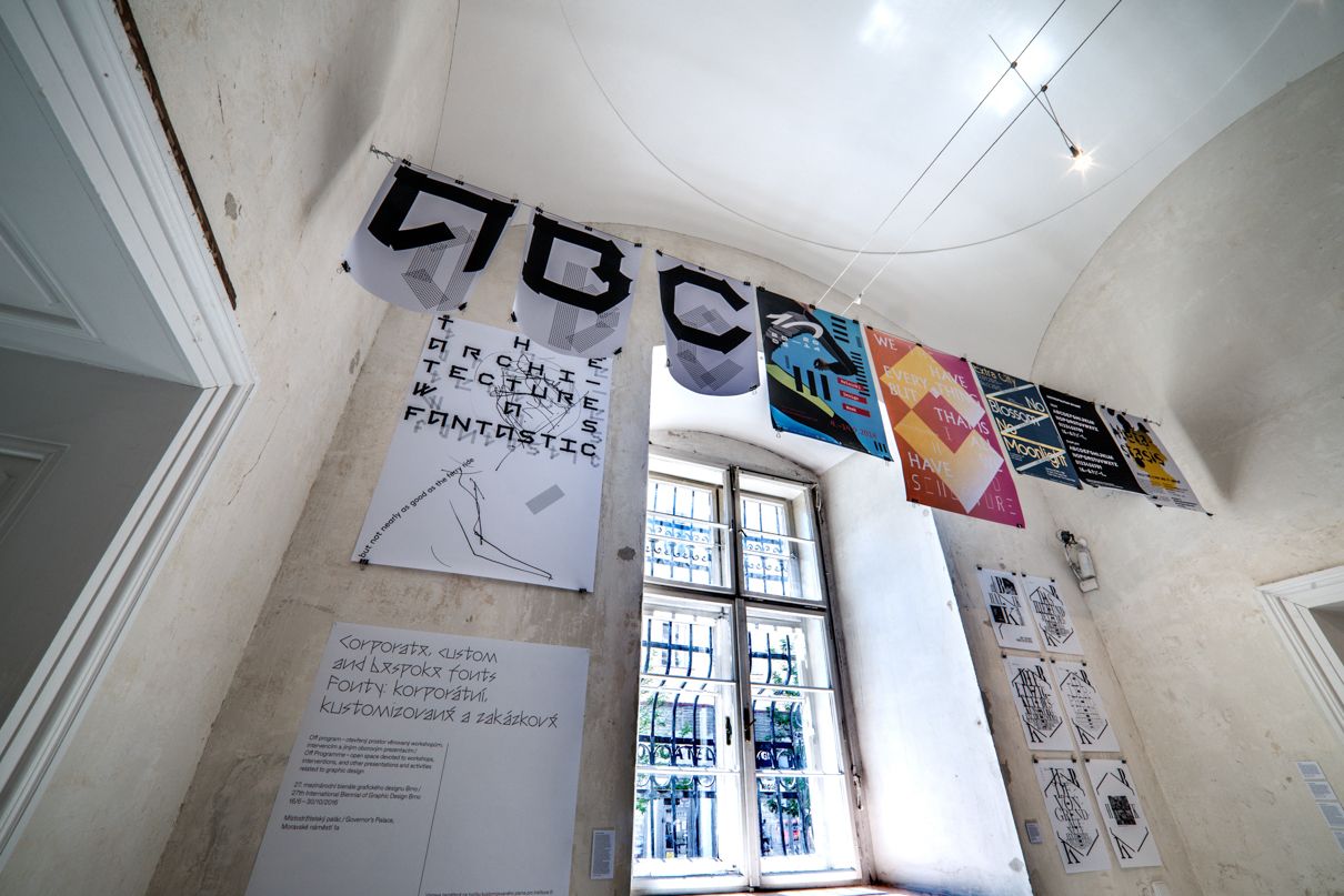
The Off Programme is conceived as an open space for workshops, interventions and other graphic design presentations. Following the success of its launch in the previous edition, this time it will be primarily focused on exhibition projects.
Wayne Daly & Adrien
Vasquez
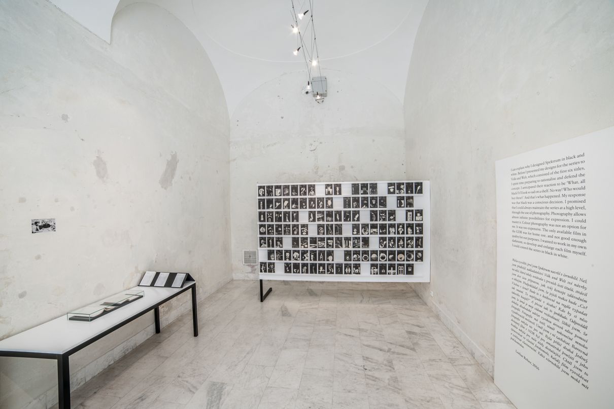
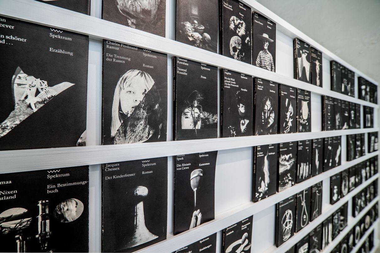
A Shelf for Lothar
A Shelf for Lothar is
a typological survey of book designer Lothar Reher's work for
Spektrum, a series of 279 books released by GDR publisher Volk und
Welt between 1968 and 1993, including short stories, novellas, film
scripts, critical theory and poems. The series design is
distinguished by its black jackets, sparse typography and a rich
and varied use of imagery. Recurring visual motifs include skulls,
female faces, frames, landscapes and museological artefacts.
As well as presenting thematic groupings of these remarkable
jacket designs, the exhibition aims to interrogate how the book as
content and the shelf as mode of display can be given equal
significance, while also attempting to disclose something of
Reher's working practices and preoccupations.
Wayne Daly (IE)
Wayne Daly is a London-based graphic designer, focusing primarily
on publishing, editorial and visual identity work. Recent projects
include the catalogue for Hayward Gallery's major
exhibition Carsten Höller: Decision (2015);
Shumon Basar, Douglas Coupland and Hans Ulrich
Obrist's The Age of Earthquakes for Penguin
(2015); and the visual identity for artist Sean Lynch's Irish
pavilion Adventure: Capital at the 2015 Venice
Biennale.
He is co-founder of Bedford Press, a publishing imprint at the
Architectural Association School of Architecture, which publishes
books and e-books at the intersection of architecture, visual art,
graphic design and theory. Collaborators include artists Gustav
Metzger, Joseph Grigely, Emma Smith and Can Altay, architects
Kersten Geers, Jack Self and Shumi Bose, and photographers Giovanna
Silva and Bas Princen. Bedford Press has exhibited numerous times
at international book fairs, including the New York Art Book Fair
at MoMa PS1, LA Art Book Fair at MOCA and Miss Read at KW Institute
for Contemporary Art Berlin.
He has contributed texts to the journals AA Files, The
National Grid and A Circular, and lectured
at various British and international schools and institutions
including the Royal College of Art, Werkplaats Typografie,
Whitechapel Gallery, the Architectural Association and the American
University of Beirut.
In 2015 he was an invited consultant to the Swiss Federal Office
of Culture for the appointment of the designer for the
2016 Most Beautiful Swiss Books exhibition and
publication.
Adrien Vasquez (FR)
Adrien Vasquez (FR) is a graphic and type designer working in
London with John Morgan. He has contributed texts and translations
to the journals .txt, Azimuts and From-To.
---------------------------------------------------------------------------------------------
Jean-Marc Klinkert
Corporate, Custom and Bespoke Fonts
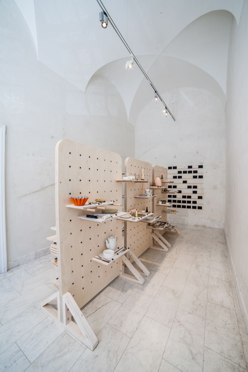
The exhibition focuses on the creation of custom characters for institutional or commercial projects. Creating a customized typeface can strengthen the identity of a brand or institution to make it endearing and recognizable. It can be considered from different approaches: starting from a concept, starting with the letters of an existing logo, an existing character to be slightly modified or created. Another approach is through the revival and digitization of historical typefaces. The steps are as diverse as the projects. The composition of the custom typeface will carry the values that the brand or institution wants to convey. The custom typeface can answer all the technical questions that may arise in a communication system; signs as necessary languages to be used, harmonization of writing systems, on-screen display, protection of font, etc. The exhibition is based on the study of recent projects of the most active studios in the field, such as Roosje Klap (Amsterdam), Kokoromoi (Helsinki, NY), Studio Laucke Siebein (Amsterdam, Berlin), Katja Gretzinger (Berlin), A Practice for Everyday Life (London), HelloMe (Berlin), DesignPractice (Brussels), Baldinger.vu-huu (Paris), L2M3 kommunikationsdesign (Stuttgart), among others.
Jean-Marc Klinkert (BE)
Jean-Marc Klinkert, 1969, Brussels. Studies visual design &
typography at the Ecole nationale supérieure des arts visuels de La
Cambre (ENSAV) in Brussels. Active as a freelance graphic designer
mainly in the cultural domain. Conference organization 'Lick my
type' with Dirk Segers and exhibitions around typography and book.
Since 2005 teaching activity at the l'ENSAV in departments visual
design & typography.
---------------------------------------------------------------------------------------------
Lotte van de Hoef & Freja Kir
fanfare
You'll find the space steady and monumentally
concrete.
In front: a beam, behind you, below you - surrounding
you.
Now put that on repeat and come again(!)
You'll find that the settings are irregular, the content -
the same, but the story different.
The chronology of yesterday is replaced with a laid-back
systematic ordering.
beams and holes and beams and holes and…
Would you enter a story from the middle? Scatter the
overview? Or read in layers?
The system represents a journey of reflections and physical
results on three-dimensions, repetitions, perspectives and
non-linear understandings.
The structure is a research into perceptions and spacious
matter explored through displays and visual communication, provided
by the Amsterdam based graphic platform fanfare organised by Lotte
van de Hoef and Freja Kir.
Lotte van de Hoef (Nl)
Lotte van de Hoef (1990) is a dutch graphic designer living in
Amsterdam. After graduating at het Grafisch Lyceum Utrecht she
continued her Graphic Design studies at the Gerrit Rietveld
Academie where she graduated in 2015. During her graduation year
she co-founded the graphic platform fanfare together with Freja
Kir, which they have been running together ever since. Besides of
this she runs her own independent studio as a freelance graphic and
fabric designer, working mainly in music- and cultural related
fields.
Freja Kir (DK)
Freja Kir (1989) (DK) works within graphic- and culturally
engaging design. After being enrolled with Art History at the
University of Copenhagen she continued her studies at the Graphic
Design Department of the Gerrit Rietveld Academie, class of 2015.
Next to her studies she studied at the honours programme in Art and
Research and worked for the lecture series Lunch Bytes. Together
with Lotte van de Hoef she runs the graphic platform fanfare which
they initiated during their graduation year. Besides of fanfare,
Freja works as a freelance graphic designer and are currently
occupied with running the wandering and wondering project Chives
Archives together with designer Celina Yavelow (CH/US).
---------------------------------------------------------------------------------------------
Pauline Kerleroux & Adéla Svobodová
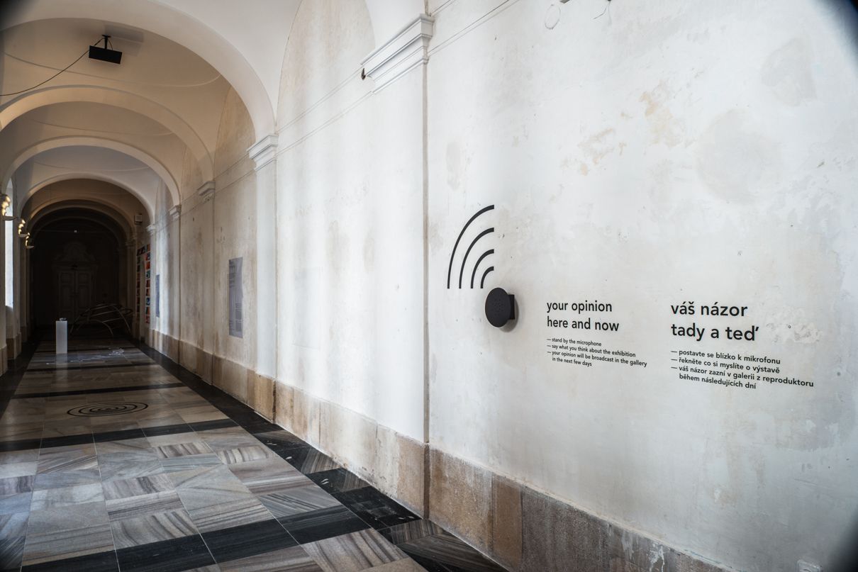
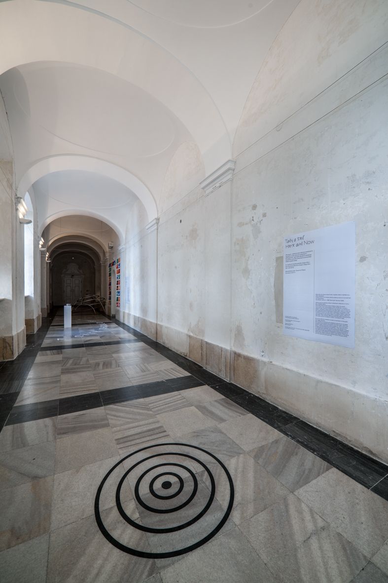
Here and Now
A piece of work is not finished until the audience come to
it and add their own interpretation.
- David Bowie, BBC Newsnight interview (1999)
By its very nature an exhibition is meant to be shown to the
public and trigger reactions.
Here and Now is a simple sound installation that
aims to complete the creative loop, between the exhibitor and their
public, within the exhibition space.
Visitors are invited to speak up - into a recording device - while
they experience the exhibition. Their opinions and thoughts are
then broadcast through a directional speaker, installed in a
suitable spot within the space, for the duration of the
exhibition.
The audience's responses and interpretations therefore become an
integral part of the exhibition; an exhibit in themselves. In that
sense Here and Now reflects authentic reactions
felt on the spot, at this particular place and particular time.
Pauline Kerleroux (FR)
French graphic designer, co-founder with Adéla Svobodová of the
Adela & Pauline studio. She currently works as an Art director
at Media Arts Lab London, and collaborates on graphic design and
illustration projects on a regular basis.
Adéla Svobodová (CZ)
Grafická designérka a umělkyně. V současné době se věnuje
především grafickému designu a grafické úpravě knih. Společně s
francouzskou designérkou Pauline Kerleroux založila v roce 2005
studio Adela & Pauline. Žije a pracuje v Praze.
---------------------------------------------------------------------------------------------
Fraser Muggeridge & Will Rose
Image, Text, Time: Typography in artists´ film and
video
A collection of historical and contemporary artists' films and videos in which typography is used to produce new relationships between image, text and time.
Fraser Muggeridge (GB)
Fraser Muggeridge is director of Fraser Muggeridge studio, a
graphic design company based in London. Throughout a wide range of
formats, from artists' books and exhibition catalogues to posters,
marketing material, exhibitions and websites, the studio
prioritises artists' and writers' content over the imposition of a
signature style. By allowing images and texts to sustain their own
intent and impact, each project is approached with colour,
typography and materials playing a key role in arriving at a
sympathetic yet subtly alluring object. Fraser Muggeridge founded
and is a tutor at Typography Summer School, a week-long programme
of typographic study in London for recent graduates and
professionals. The exhibition 'Willem Sandberg: from type to image'
is currently on display at the De la Warr Pavilion curated by
Carolien Glazenburg, Stedelijk Museum, Amsterdam, in collaboration
with Fraser Muggeridge and De La Warr Pavilion.
William Rose (GB)
William Rose is a Leeds-based producer, curator and researcher
working mainly in the field of artists' moving image. He is
currently completing a book of writings and lectures by the
American avant-garde filmmaker Ken Jacobs. Recent production
projects include To the Editor of Amateur
Photographer, a long form film by Luke Fowler and Mark Fell
which has screened at venues including MoMA and at the
International Film Festival Rotterdam; and Little Birds
and a Demon, a sound work broadcast from a lighthouse in
Shetland by artist Grace Schwindt.
---------------------------------------------------------------------------------------------
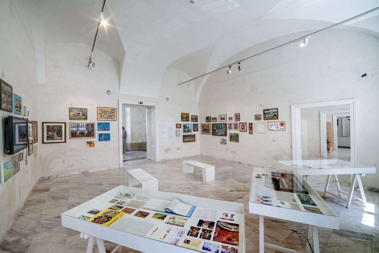
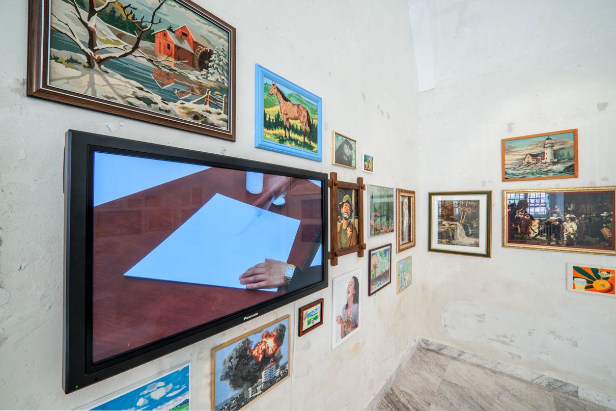
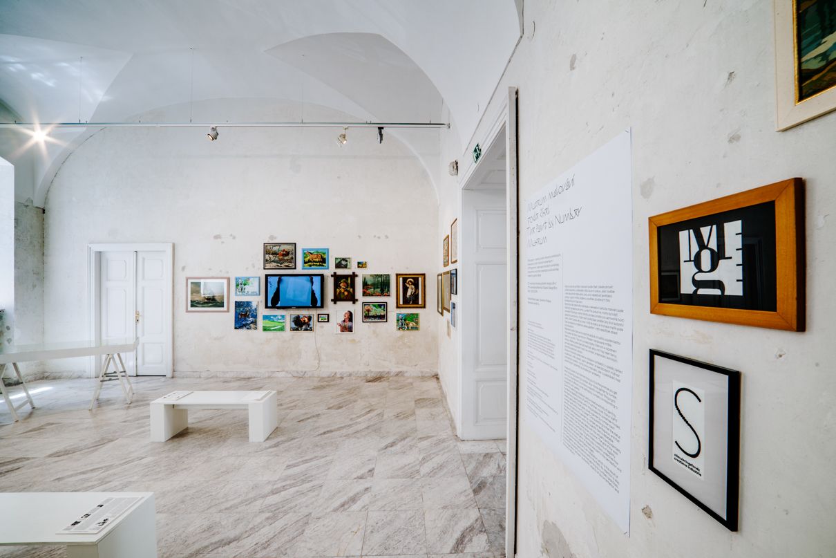
Émilie Ferrat, François Girard-Meunier
Tha Paint by Number Museum
A beautiful work of art the first time you try is the promise
you get when acquiring a paint by number. As a novice painter by
number, your only requirement is to follow a specific method:
filling a grid composed of different zones defined by numbers
corresponding to a specific color palette.
Could this seemingly stubborn and uncreative activity of paint by
number be labelled a form of "art"? If not then, could it be a
"craft"? Are there any opportunities within this process for some
free-minded, creative gestures? In that case, could a painter by
number claim a certain authorship over his "piece"? One sure thing
is that the status and the motivations of a painter by number are
ambiguous, and that the idea of self-expression within this
specific field is debatable.
Paint by number conceptually deals with the virtuality and
potentiality of a work rather than the work as an outcome. The grid
of the work is there, waiting to be filled. This grid raises
questions of legibility and recognition of an image. A painting by
numbers underlines how colors, but also simplification of shapes
play part in the perception and reproduction of iconic,
identifiable images.
The Paint by Number Museum is an installation which
is the result of an investigation and speculations within this
field. Its intention is also to stress the possibility of
subversive painting by numbers practices. It is a negotiation
between "authentic" objects of documentation and fictional
artefacts.
This project is supported by the Stimuleringsfonds Creatieve
Industrie.
Émilie Ferrat (NL)
Émilie Ferrat (b. 1992, Paris) is a graphic designer. She
graduated from the Gerrit Rietveld Academie in 2015. She is
interested, among others, in how images and stories are
constructed, produced and circulate, and in how codes of
representation can be appropriated and de-contextualized /
re-contextualized. She currently works in Amsterdam, the
Netherlands. Among her collaborators is François
Girard-Meunier.
François Girard-Meunier (CA)
François Girard-Meunier (b. 1990, Montréal) is a graphic designer.
He graduated from the Gerrit Rietveld Academie in 2015. He is
interested, among others, in visual culture, with an strong
interest in the questions of authorship and representation. He was
recently invited to the Canadian Center for Architecture in the
context of the Call for Captions residency (supported by the Andrew
Mellon Fund). He currently works in Amsterdam, the Netherlands.
Among his collaborators is Émilie Ferrat.
---------------------------------------------------------------------------------------------
Scott Joseph
Seeing What Is Seen, As What Sees Can Not Be
Saw
When living in a world with speech and also writing we know
communication is paramount. Although, communication can often fall
short. And within the words we use we can often read in between the
lines of words themselves. It is as if some other kind of emotive
charge were actually present that was not initially being
articulated.
Seeing What Is Seen, As What Sees Can Not Be Saw is
a part movie segment, part stop motion, abstract documentary film
which utilises how humans interact with the inanimate world to
offer representation as depicted evidence of renewed forms of
communication existing between humans and the surfaces and material
they find themselves in the vicinity of.
Such an opportunity for depicting the twinned silence between the
contours of a surface and the fragmentary form of an existing or at
times, non existing silhouette is a very rare but at the same time
almost ever present occurrence.
Suggested through the quick cut images and their overlaid but
sequential corpus is a kind of containment of the minds
geographical spectrum paired down into an almost archaeological
infliction for how contact with materialism necessitates itself as
a basic need for well being, just as the words that exchange and
exist between us do as well.
Scott Joseph (GB)
Scott Joseph (1983, UK) is a designer currently based in London
and is a graduate of the graphic design department of the Gerrit
Rietveld Academie, Amsterdam, NL. His work as a graphic designer is
held in the MoMA Library, New York and in the Stedelijk Museum
archive, Amsterdam. Recent projects include: 'Seeing What Is Seen,
As What Sees Can Not Be Saw', 27th International Biennale Graphic
Design, Moravian Gallery, Brno, CZ (2016); 'Found When Out', Pump
House Gallery, Battersea Park, London, UK, (2015); 'The Tone Is
Theirs', Offprint Artist Book Fair, Tate Modern, London, UK,
(2015); 'Under The Sign', P/////AKT, Platform for Contemporary
Arts, Amsterdam, NL, (2014); 'Titles', The Session Magazine, Goethe
Institute, Amsterdam, NL, (2014); 'The Torch In My Ear', 'Mute
Written Orchestration', Deep Cuts, Marres, Centre for Contemporary
Culture, Maastricht, 2013; 'Rong-Wrong' (printed anthology),
self-published; various contexts, (2012). Scott Joseph has also
taught within various institutions including University of Creative
Arts, UK, University of East London, UK and during 2016 has been a
guest tutor within the graphic design department at ArtEZ Institute
of Arts, Arnhem, NL.
---------------------------------------------------------------------------------------------
Design Displacement Group featuring
Noviki
The Death of Graphic Design, An Opera
The Design Displacement Group (DDG) claims an imaginative
territory that spans time, place, discipline, culture, gender and
nationality. The group consists of sixteen members collaborating in
shifting constellations across a range of projects that take form
(in real time) through commissioned client projects, self-initiated
works and open-form workshops. DDG practices a working method that
should be read as collective and post-signature; a mechanism to
reflect, refract and speculate upon alternative frameworks for
'productive' engagement and exchange.
During the 27th Brno Biennial, the Design Displacement Group will
re-appropriate the narrative format of the opera. The four grand
themes of this opera (and any other tragedy) being love, jealousy,
ambition and revenge are the basis of our story exploring the
theatrics and performative requirements of a design practice. These
narratives will unfold through an immersive audio-visual
presentation depicting scenes rich with intrigue, gossip and
speculation.
Design Displacement Group (NL)
Design Displacement Group (DDG) was founded after a discussion
with a group of designers and a social scientist from various
disciplines, levels, cultures and nationalities in July 2014.
Design Displacement Group is a collective exploring the future of
design, both in practice and in thought. Collaborating on
different, often self-initiated projects in changing compositions,
DDG claims imaginative fictional design territory in order to open
up the fields of design thinking and doing. Recalling The Artist
Placement Group lead by John Latham and Barbara Steveni, in the
60's, DDG finds their notion of 'placement' to reposition the role
of the artist within a wider social context. DDG shares an interest
in this approach, but instead considers the idea of
'dis'-placement. They exploit the axes of time, space and location
to critically reflect back on the practices of (graphic) design
today. Design Displacement Group is interested in design's
collective thinking and in developing new ways and methods of
working collaboratively and simultaneously, mainly while working
online. This process leaves behind the 'autograph' of the graphic
designer to a collective kaleidoscopic junction. DDG constantly
lets things go and accepts failure by doing so. This gives an
enormous amount of freedom which is difficult to find in an
individual practice. DDG uses graphic design as a tool for
communication but more importantly as a playtool, with which they
try to challenge an own discourse. Humour is a sort of subversive
strategy in the visual language of DDG. Design Displacement Group
is an elastic formation, the amount of people contributing and the
ways of working and attacking a project of assignment, is always
changing.
---------------------------------------------------------------------------------------------
Shu-Hua Chang, Ingrid Rousseau, Maki
Suzuki
The Taste of The Brain
A platform of idea exchange, which is organised by design students from Switzerland and Great Britain. In the format of brunch, the team wants to share the passion of design and food. However, food is not the only content on the dinning table, tableware is also considered an important part of this beautiful cultural landscape. The Taste of the Brain intends to gather people from different backgrounds, to discover the stories behind the tablewares, and to get fed by design with a new experience of food.
Shu-Hua Chang (TW)
Shu-Hua Chang, product designer from Taipei, Taiwan. She came to
Switzerland and met Maki and Ingrid at school. As a product
designer, she is fascinated by different applications and
combinations of materials and making process. She currently engaged
a lot her work in scenography design. By mixing her addiction of
human touch of art crafts into rational production process, her
works discover both side of human society, industrial and natural
sides.
Ingrid Rousseau (FR)
From a graphic design background, Ingrid Rousseau decided to move
to Switzerland in order to do an interdisciplinary master, with
interior architects and product designers. Graduated in June 2016,
this master was a good opportunity to extend her vision of Design.
Graphic design is not only something looking good but also it's
based on a concept of communication. Recently, Ingrid Rousseau
co-founded with Ghida Bahsoun, a production-company based in
Switzerland and called Guffetsch.
Maki Suzuki (FR)
Maki Suzuki, member of Åbäke, which is a transdisciplinary graphic
design collective, founded in 2000 with Patrick Lacey (UK),
Benjamin Reichen (FR), Kajsa Ståhl (SE) in London, England, after
meeting at the Royal College of Art.
---------------------------------------------------------------------------------------------
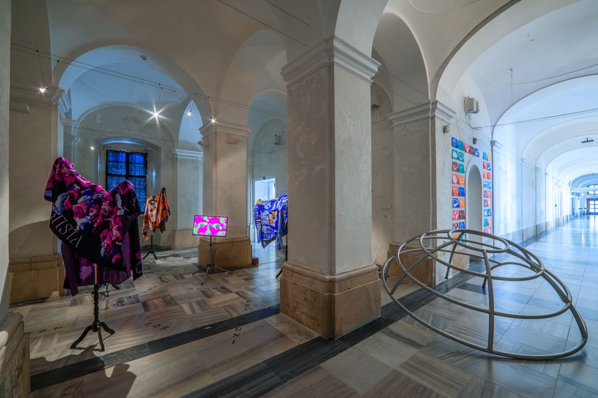
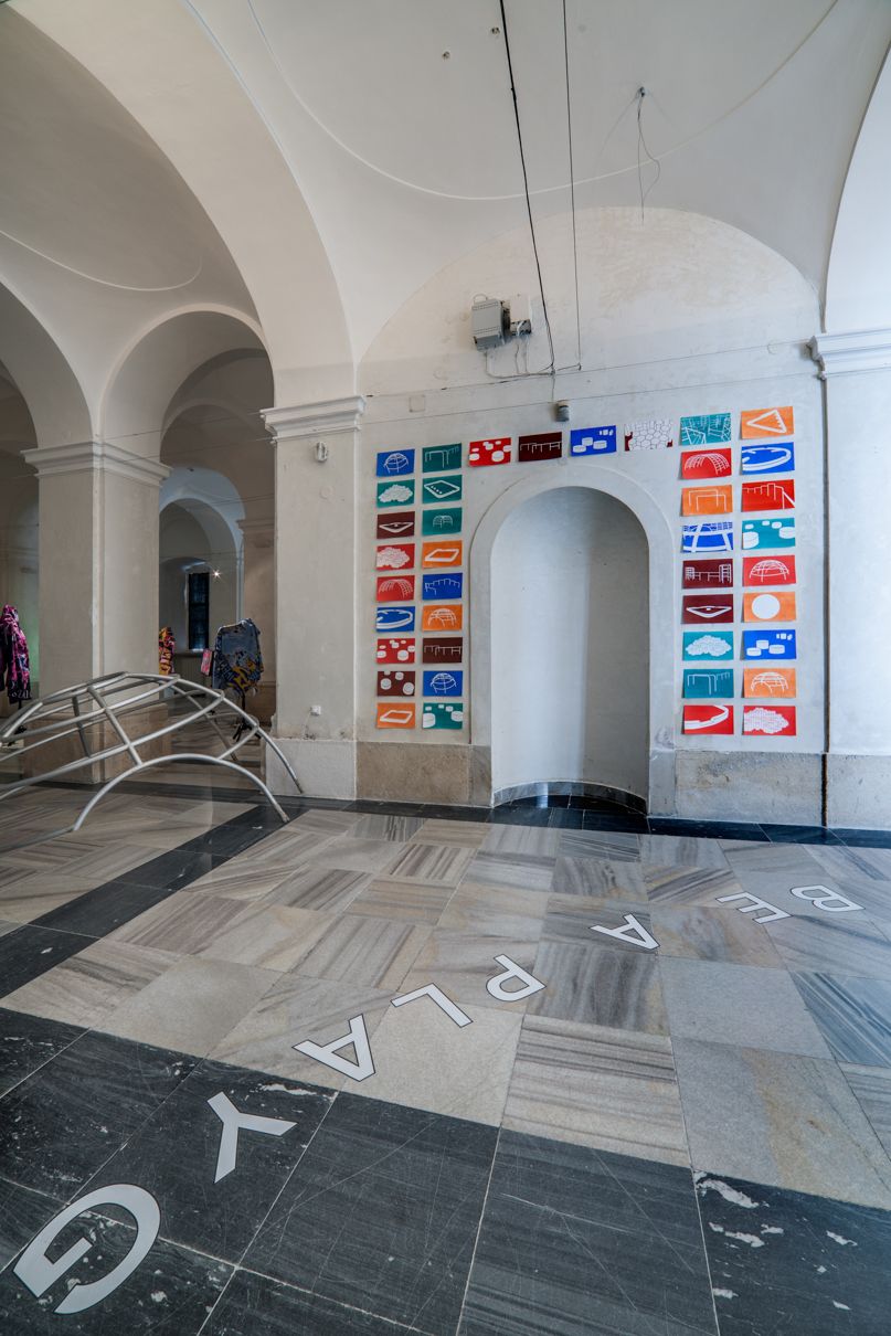
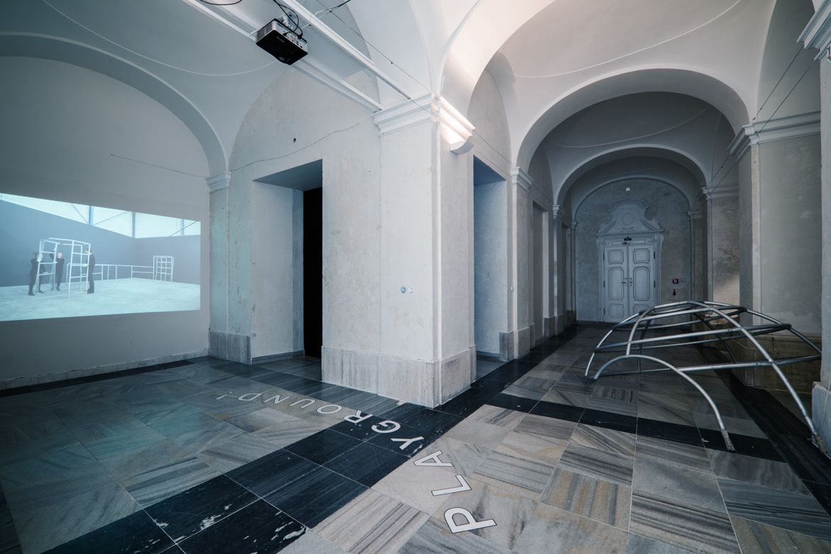
Denisa Kollárová & Anna van Lingen
Tools of Imagination
We - Denisa Kollarová and Anna van Lingen - live in an era in which there are not many carefully constructed playgrounds. We don't like what we see. Have we - city decision makers, architects, designers, parents, friends - forgotten to be critical? There are so many architects, artists and thinkers of the past who have proven that a playground can be much more than just generic plastic structures placed randomly, constructed by simply flipping through the pages of play equipment catalogues.
We have the right to public space, to play, to playgrounds! Tools of Imagination is inspired by the design philosophy of Dutch architect Aldo van Eyck. The project explores playground design through several media: a publication, a series of lectures, an original adopted climbing frame by van Eyck and a video work made in cooperation with the Rijksmuseum.
Van Eyck's exceptional designs have influenced generations of children at play in Amsterdam. After the second World War, van Eyck dedicated himself to developing a web of over 700 playgrounds scattered across the city, in order to give children their own recognizable domain. Nowadays only a few play elements remain. An important aspect of Aldo van Eyck's designs is his strive to stimulate the imagination and ingenuity of the child, which is visible in the abstract shapes of his play elements.
Denisa Kollarová (SK)
Denisa Kollarová lives and works in Amsterdam, where she and Anna
van Lingen began their collaboration after graduating from the
Gerrit Rietveld Academie in 2013. Ruins, public spaces, social
architecture, city mapping and utopian architectural planning are
core topics which keep her curiosity alive in various books,
exhibitions and lectures. In addition to Seventeen
Playgrounds her ongoing projects include Under
My Own Construction Of Ruins and Migration Of
Form.
Anna van Lingen (NL)
Anna van Lingen is a graphic designer working on a number of self-
initiated projects which investigate town planning, architecture
and the ageing of cities and buildings. She works closely with
Denisa Kollarová, on an ongoing project centered on children's play
and playspaces. In beginning of 2016 Seventeen Playgrounds, a guide
to Aldo van Eyck's designs for children in the centre of Amsterdam
was published by Lecturis as a result of their research. Anna van
Lingen finished her studies at the Gerrit Rietveld Academie in 2013
and lives and works in Amsterdam.
---------------------------------------------------------------------------------------------
The authors are solely responsible for the nature of this events. The program is subject to change.